Thursday Travel Photography: Understanding what is a technically bad image.
Today’s edition of Thursday Travel Photography is intended to help you understand what makes an image a technically poor one. Obviously, a good(and easy) way to make better pictures is to first eliminate the negatives.
The second part of this article has weekly image reviews. If you would like to have your images reviewed to know what worked well and how it could have been improved, choose some of your best images and post them on group pool of India Travel and Photography. Don’t forget to tag them as itpcritique, so they can be chosen for review. You can also post your questions related to photography as a comment to this post, or in India Travel and Photography group discussion. I will answer them in next week’s article.
TECHNICALLY BAD IMAGES
Just a small number of parameters define the technical quality of an image, which can be easily understood even by the most amateur photographer. And once understood, a constant watch at these parameters can help make improvements in the pictures. Here is a list.
1. Exposure – dark, burned areas, etc
When there is too much contrast in the frame you are shooting, it is very likely that some areas of the image get exposed badly. For example, if you are shooting a building when the sun is high, you might see that the sky may appear fully white in your picture, even if you have had a blue sky. Similarly if you have a reflecting metal surface in the frame when you are shooting indoors, the areas of the reflecting surface may appear completely white in the image. Look at the example below.

The prayer flags are looking fine in the image, but the sky is completely white, or burnt, as it is often called. Burnt areas usually make an ugly sight in a picture. The image would look considerably better if the details of the sky were visible properly. See the picture below, which was exposed correctly. As you can see below, the clouds are seen clearly and so are the peaks of the distant mountains.

The reverse also can happen, where most of the image is exposed properly but some parts have turned out completely dark. Taking the example of a building in the afternoon sky, or when the sun is right behind the building, you may also end up with just a silhouette of the building with no details visible. Either way, it makes a technically bad image. Unless ofcourse your intention was just to get the outline of the building.
2. Sharpness – camera shake and out-of-focus images
Camera shake is one of the biggest problem in photography, especially if you are shooting indoors. The image may look fine on the LCD, but camera shake may become obvious when you see the full size image on the monitor. Sometimes it is not evident, but the overall image quality will not be as good as it should be even if there is slightest shake in the image. Look for ghost shadows in the edges to determine if the image is perfectly sharp. More sharp the image, more pleasing it is likely to appear to the viewer.
The image below may appear sharp enough even when you see it in full size. But if you look carefully, you can see a yellow ghost line at the right edge of the petal at the blow-up of the image below.


The culprit here is camera shake. Such faults may not appear significant, but they make a lot of difference to the quality of the image.
In a similar way, an image where the subject has gone even slightly out of focus also affects the sharpness, and hence the quality of the image. Always check the image carefully in full size.
3. Other blemishes – sensor dust and chromatic aberration.
Sensor dust is a problem in DSLRs if you frequently keep changing lenses. It can cause black patches in the picture, which is more evident in images that have lot of sky in the frame. To check for sensor dust in the your camera, take a picture of plain sky on a bright day and see if there are any dark patches in the image. Get is cleaned at your camera service center.
Chromatic aberration (CA) is a phenomenon where you see purple or cyan bands along the edges where contrast is very high. This is a problem created by poor lens quality. Look at the example below. These bands appears only when the contrast in the picture is very high(such as backlit images). Expensive lenses tend to be better at handling such situations, but it is hard to avoid them in cheaper kit lenses in situations where there is too much variation in light.

If you are seeing too much CA with your lens, avoid shooting where the background light is too strong.
Another lens related problem is called vignetting, usually seen in wide angles lenses. It is a phenomenon where the corners of the images appear darker compared to rest of the image. It can happen in ultra wide-angle lenses, where the lens edges or mounted filters may block some light entering into the lens. Remove any filters on the lens if you notice this problem.
Some of these problems are related to the devices(camera/lens) you are using, and in such cases there is no easy solution to the problem. A steady hand or tripod can fix camera shake. Read my earlier article on holding the camera steady. To correct dark or burnt areas requires exposure compensation (more on this in future articles).
IMAGE REVIEWS
The image below is posted by flickr user vdeepu
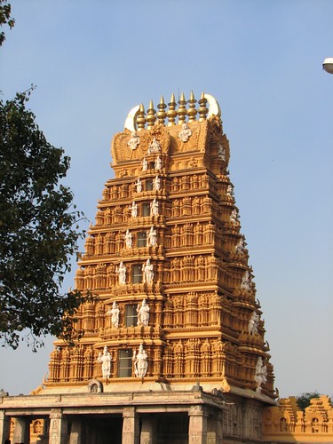
I can’t find much fault in this picture. The lighting here is good – sky and the temple are exposed properly. The image also looks sharp. But to me, it also looks a bit dull and more like a documentary image showing something as it is. I do not know how the surroundings of the temple look like, but if there was some element of life, or if there was was more to it that depicted the tower against its environment, the picture would appear more enriched. It would also work well if the Gopura was framed within another frame(such as pillars of a mantapa). Or another possible option would be to stand under a tree and have some hanging leaves on the top of the frame. These are just some possibilities. More such options would exisit and is best decided on location, depending on the environment. Including the atmosphere around the tower helps provide a context to the viewer, and gives a better outlook of the atmosphere. The lamp in the top-right that has sneaked into the frame can be avoided.
If you would like to have your images reviewed to know what worked well and how it could have been improved, choose some of your best images, post them on group pool of India Travel and Photography and tag them as itpcritique. Only tagged images are taken for reviewing. You can also post your questions related to photography as a comment to this post or in India Travel and Photography group discussion. I will answer them in next week’s article.